Choosing the right font can help your students better distinguish letters and make reading easier. That is why Typing Pal now offers a choice of several fonts in which to display the exercises and practice texts.
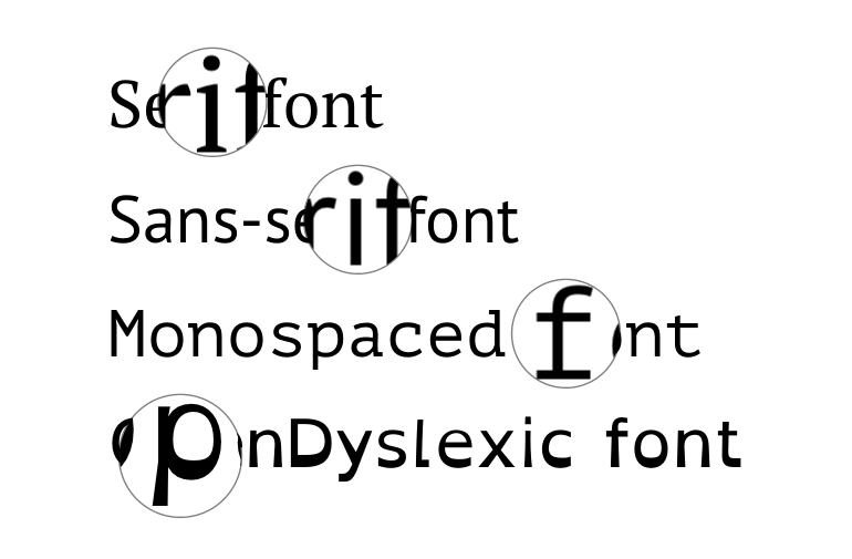
Characters displayed in serif fonts have lines attached at the top and bottom of a letter's stroke. These lines accentuate the differences between letters, making them easier to differentiate. Serif fonts are great for reading small text at close range.
Sans-serif fonts are good for reading large text, and they are generally considered to be the easiest to read on screens. Sans-serif fonts are traditionally used for titles or short texts.
Letters in monospaced fonts all occupy the same amount of space, regardless of their size (for example, i and w take up the same amount of space), giving each one equal importance. This type of font is commonly used in programming, as it facilitates reading computer code.
Lastly, the OpenDyslexic font was specially designed to meet the needs of students with dyslexia. The bottom of the letters have been thickened in order to help the brain recognize their orientation. This change, along with the varying widths of the letters’ stems, facilitates reading, as it prevents confusion of letters like d, b, p and q.
Font selection is carried out via the display options.


